Typography | Task 3
|| 22/04/24– 24/07/24 (Week 1 – Week 14)
|| Guan Yaxin 0370687 BDCM
|| Typography
|| Task 3
THE LECTURES
Week 9
In this lesson, the teacher introduced the tasks we were going to do, and
taught us how to draw the draft of the font design with three kinds of pens,
and we could also use tablets and other tools to complete the sketch and
analyze it
Week 10
In this lesson, the teacher taught us how to use AI to digitize our font
draft, taking m in bembo font as an example, to deconstruct and draw
Week 11
In this class, the teacher introduced a new software named fontlab 7, and
taught us how to use AI to set preferences and import fonts. The overall
operation was rather complicated, and the teacher explained it very
carefully
Week 12
In this class, the teacher taught the relevant knowledge of sentence
spacing, which can make font design more beautiful, and put forward some
suggestions for modifying the fonts designed by some students
INSTRUCTIONS
Our ultimate goal is to design some Western letters of our own design.
First, we need to draw our own sketches, after the teacher's feedback, use
AI and fontlab7 to digitize, and finally use our own designed fonts to make
a regular poster.
The rules are:
Use four or so sentences or words, and you cannot change the size of the
sentence, you can use alignment and composition, the size is a vertical
layout of a4 size
First, we need to draw a draft. I used the way of hand drawing and pen to complete the basic sketch. I gave my sketches back to my teacher, who picked one for me to digitize. The teacher taught us how to use ai to deconstruct and draw fonts. In the end, I made a brief change on the basis of the draft, and finally digitized it.
These are drafts of my design.


FEEDBACK
Week9
We will learn a new part in this class, namely font design. In class, the
teacher first explained the relevant knowledge of fonts to us, and I drew a
sketch according to the teacher's requirements after class.
Week10
For this week's homework, the teacher demonstrated the structure and
drawing of the letter m, taught how to digitize letters, and he explained
the position spacing of auxiliary lines and digitized lowercase letters,
taking tyd as an example. After class I digitized the drafts I made
Week11
This week, the teacher taught us to use the new software fontlab and
explained some related knowledge. When I gave my homework back to the
teacher, he explained the problems in my homework to me
Week12
In the last class, the teacher explained our homework and gave
corresponding instructions. After solving the existing problems, the fonts I
designed became more reasonable
REFLECTION
Experience
Through this exercise, I learned how to design fonts by myself and came
into contact with a new software, font lab. The overall task was rather
troublesome this time, and the most difficult part was the process of
digitization of sketches, because the design of letters must be rigorous, so
as to be more beautiful
Observation
The new tool we have access to is font lab, which is a font design
software, we can use it to design fonts and arrange font spacing,
capitalization, punctuation and so on. This software is very friendly for
font design, but the operation is still troublesome. However, with the
teacher's explanation, I gradually became proficient in using this
software
Discover
In general, this task was rather tedious, especially the process of digitization of the sketch, which made me very upset. However, the teacher was very patient to solve my problems, and I am very grateful. Through this time of study, I understand and learn how to design my own fonts, and I will apply this skill to my future design career
Further Reading
British Standard Type creates "bright and playful" font family for
Yinka Ilori
Alyn Griffiths | 27 June 2024 1 comment
Type foundry British Standard Type has developed a custom typeface for British-Nigerian designer Yinka Ilori that blends rounded and square shapes to reflect his dual
heritage.
Ilori, who is known for his vibrant
and playful designs, previously used a generic typeface across his different
multidisciplinary projects but wanted something bespoke to embody his
distinctive style.
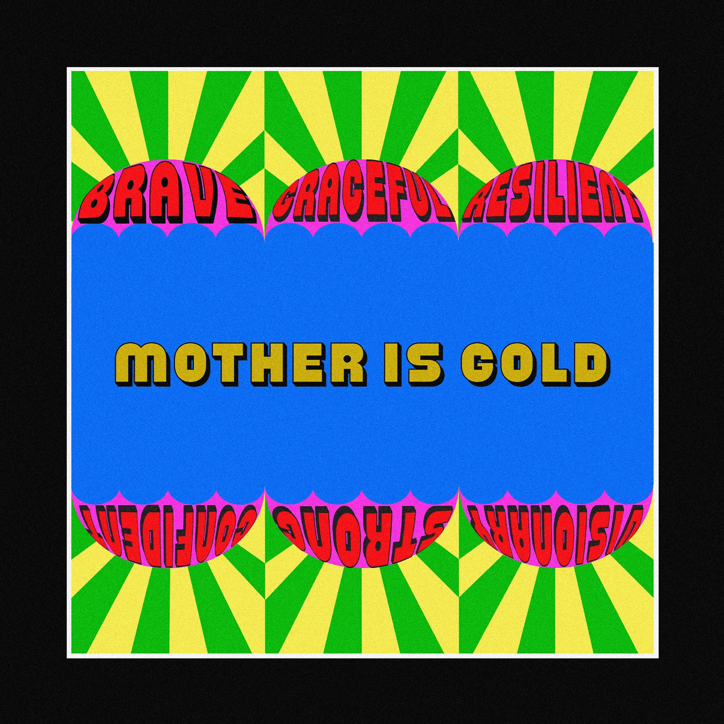
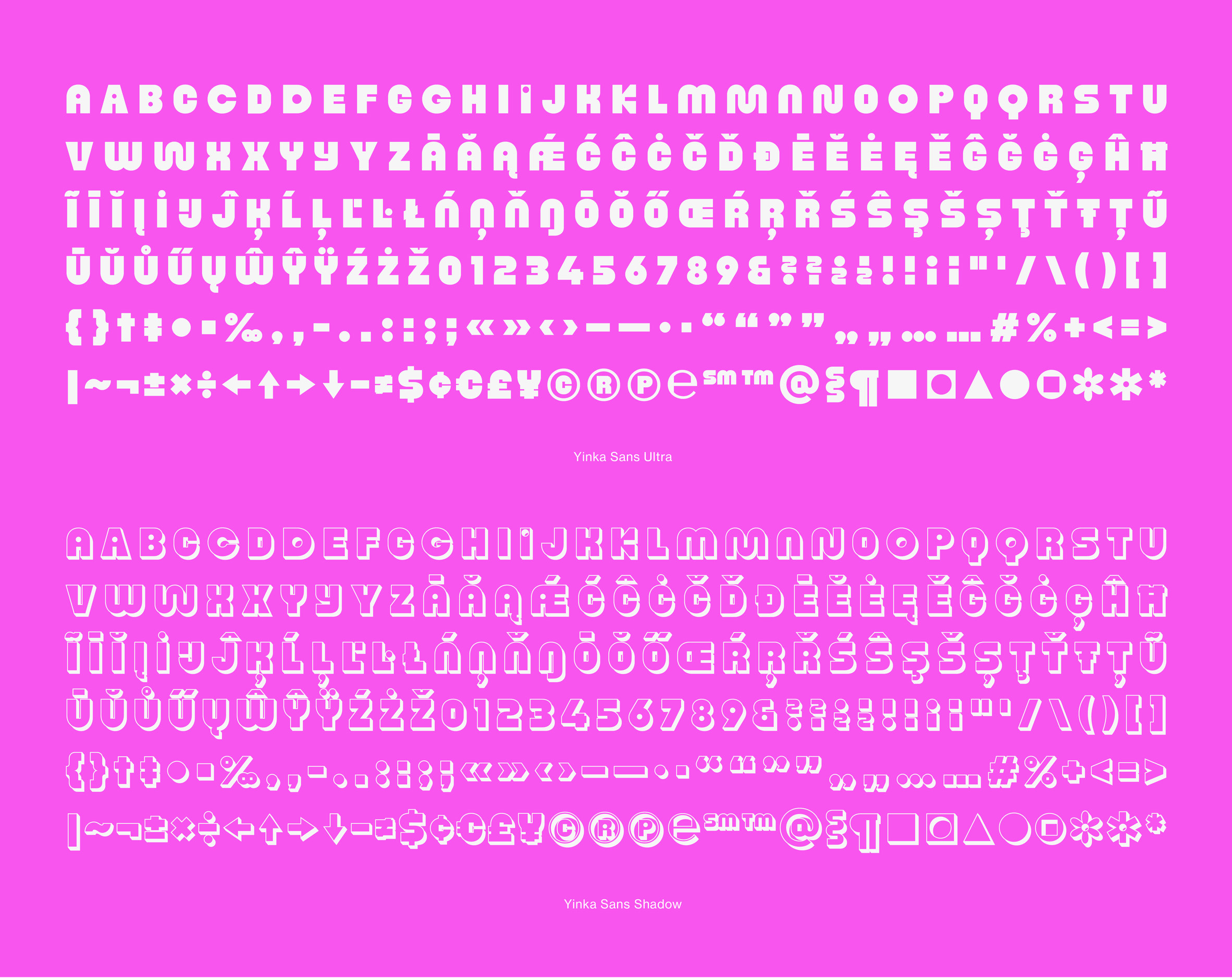
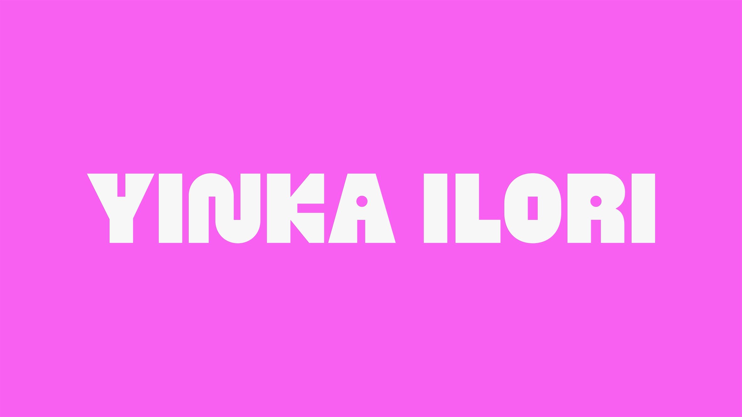
The result of the collaboration with British Standard Type (BST) is a display typeface duo called Yinka Sans Ultra and Yinka
Sans Shadow, which function as an extension of the designer's visual
identity.

"I've always been drawn to the idea of creating my own typeface as a way to
tell a story through design," Ilori told Dezeen.
"I love how certain fonts have the ability to inject meaning and
personality into text and with Yinka Sans, it's both unique and reflective
of my work."
Ilori gathered together a broad range of references to guide the design,
borrowing from musical culture, architectural motifs, Nigerian folk
vernaculars and contemporary popular culture.

These inspirations, along with his dual British-Nigerian heritage, informed
a solution that combines playful, rounded forms with structured squared-off
elements.
"My core values were strongly applied when curating Yinka Sans Ultra and
Yinka Sans Shadow, as it's through the bright colours, different shapes and
playful designs that I had the opportunity to bring a firm sense of optimism
and inclusivity to the text," Ilori said.

BST crafted the typeface's two cuts to ensure they achieve the expressive
visual style Ilori requested while achieving the necessary level of
functionality and readability.
"I wanted the typeface to retain its soul and flair without compromising
too much on practicality so that it can be used effectively in various
applications," Ilori added.

"Yinka's thoughtful approach to his craft, coupled with his infectious
enthusiasm and ambition to infuse the overlooked with beauty and joy,
profoundly influenced every facet of our collaboration," said Matthew Fenton
of BST.
"It's been an honour to contribute to bringing Yinka's vision to life and
we eagerly anticipate the continued impact of Yinka Sans in furthering his
broader mission of celebrating diversity and spreading some much-needed joy
into the world."

The design of Yinka Sans Ultra, with its dynamic forms and bold colour
options, is complemented by a version that references Ilori's use of shadow
effects.
The array of stylistic sets provides a toolkit that can be used across the
designers multifaceted projects, from printed surfaces to three-dimensional
structures and objects.
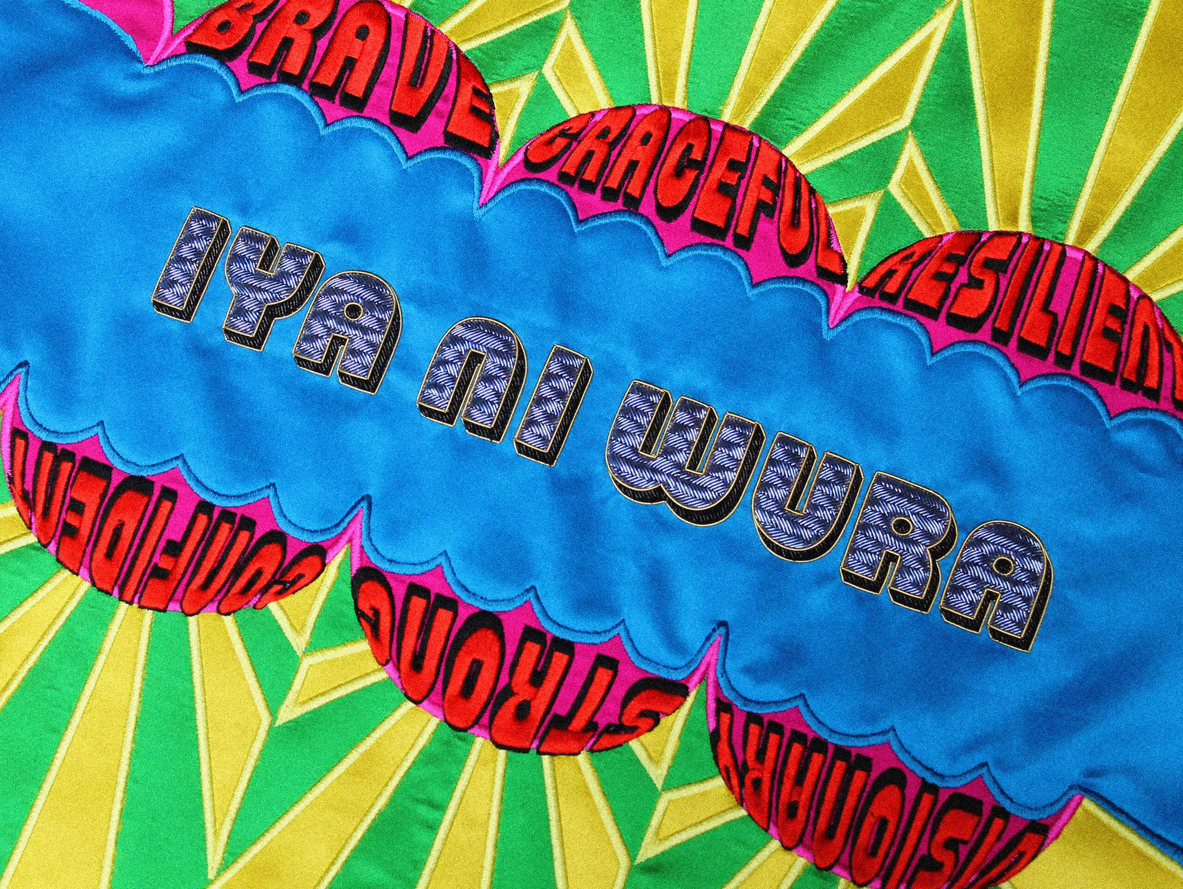
The designer is currently using the font for installations and fruniture
such as the embroidered upholstery for his Iya Na Wura furniture collection. Future applications are likely to include
public art projects and exhibition designs.

Ilori's humorous, provocative and playful designs seek to bring communities
together and have a positive impact on society by evoking a sense of joy and
optimism.
In an interview with Dezeen in 2022 he explained how he uses colour to start conversations and inject fun
into projects such as a pavilion with multi-hued facades created in collaboration with architecture office Pricegore for the
2019 London Festival of Architecture.
His recent work includes a mirrored pavilion intended to encourage reflection of racism in
sport ahead of the Euro 2024 football tournament and an installation in
east London featuring two oversized chairs decorated with vibrant prints.


评论
发表评论